We began with a Brand Intensive with the owner to define the voice: plain-spoken, warm, and honest — “Support at home, built around your family.”
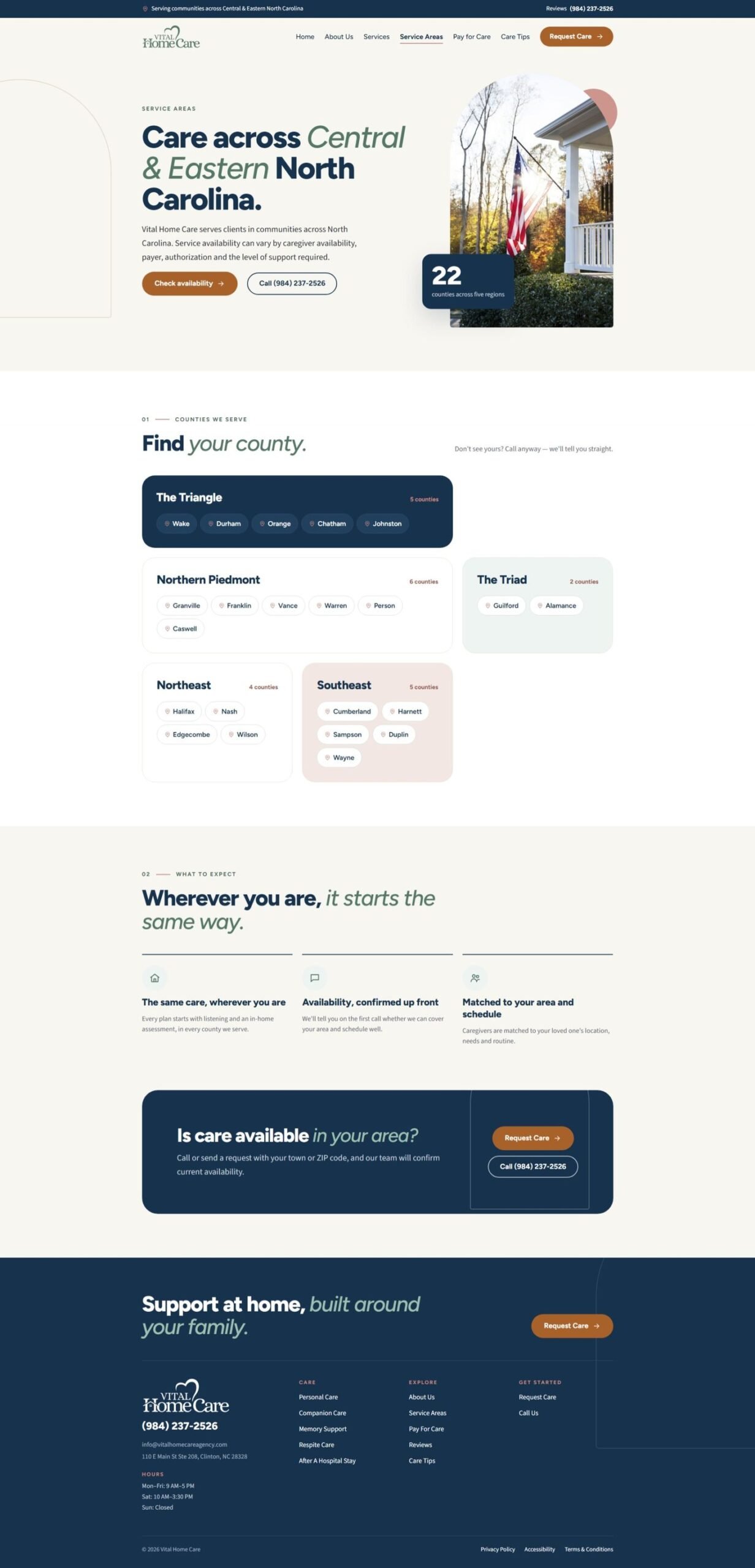
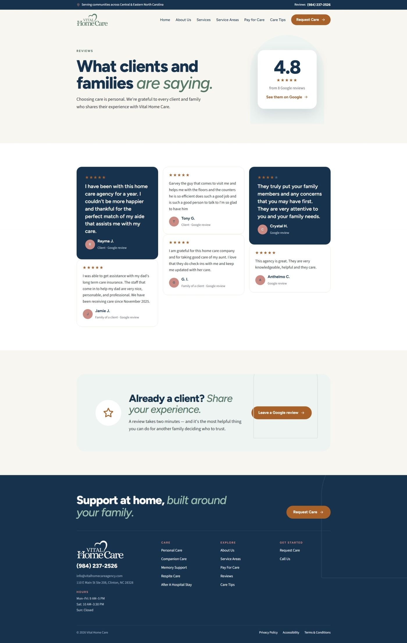
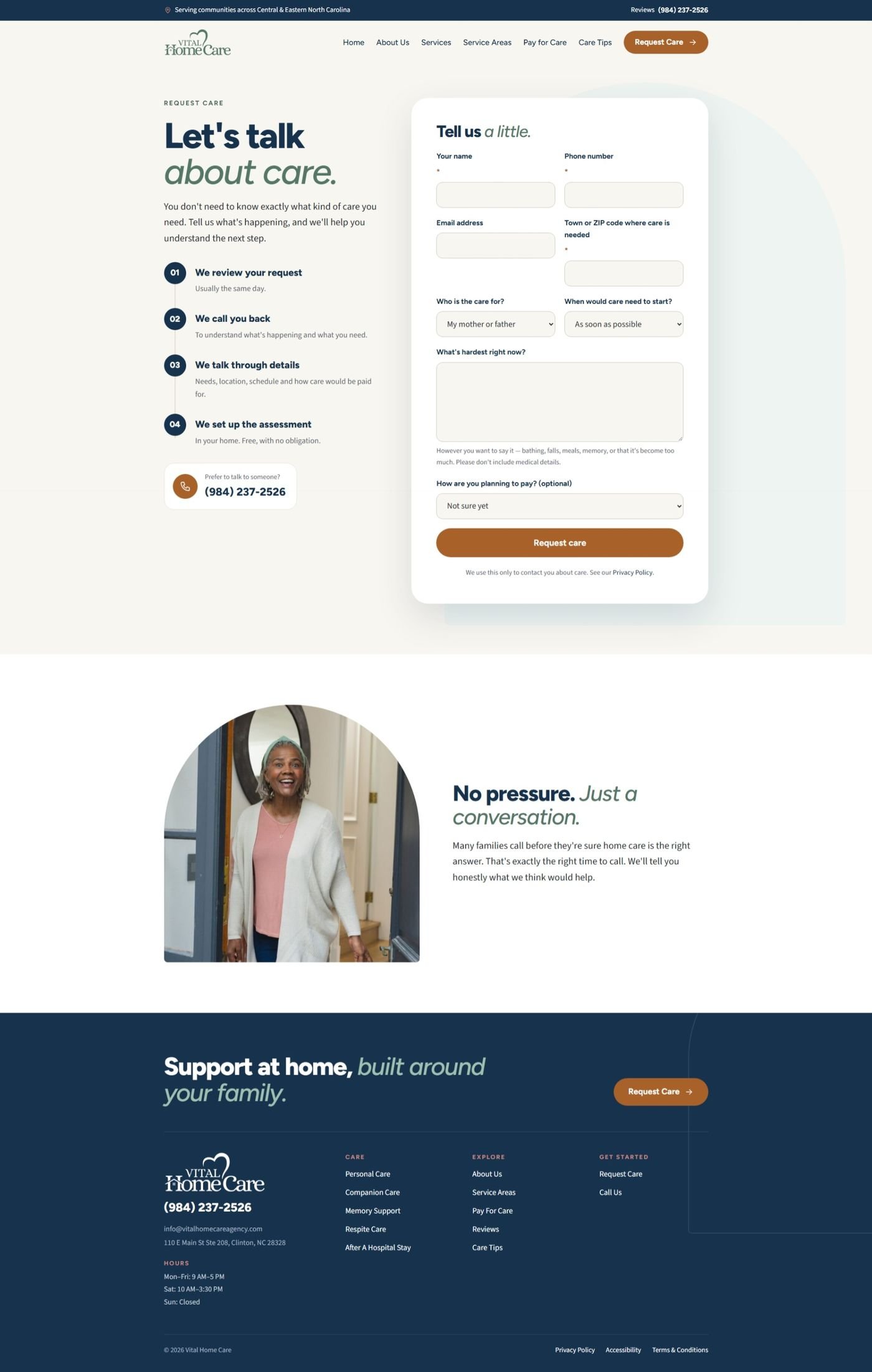
Then we built the visual identity in navy, sage, and copper and built the website: services, service areas by county, reviews, care tips, and a request-care form written to ask for only what the team needs to call back.